
Design Systems for the People
Why your idea of design system sometimes works only for the privileged

When you think about design systems, what do you think? Chances are, you are a product designer and you think about components like buttons, forms and menus that fly in and out. Hold it, I am not going to debate about what constitutes a design system or whether it contradicts with style guide. But in the case you’re designing a system, any kind of system, there’s one rule that should exist: it should serve the best scenario, as well as the worst scenario (or at least, mitigate it). Then, you have to make sure that everybody applying it should do it properly and source it from one single documentation. Right? Right! But unfortunately design system often goes only as far as that, a system. A system that nobody refers to.
I remember when I was a graphic designer, brand guideline was the thing, even until now. This was the holy grail in the religion of brand expression… deviate from it and you’ll be stoned to death. Pretty much that.
I remember that one time, the Indonesian energy company, Pertamina, rebranded their company that also came with a fancy new logo, done for close to US$260,000 in 2005. It was shocking to anyone in Indonesia that a logo cost that much (okay, yes, other companies paid millions, but still). Of course, a rebrand goes more than just the logo, but that’s what people saw. For me, the worst thing about it is not the logo, but the implementation. On displays everywhere, in the gas station, on the truck, on the vehicles, and sometimes on ads, the colors were off, elements were laid out disproportionately, the typeface wrong. It was Landor’s nightmare, I believe, to have designed such polished end result, but then only to get people butcher the whole thing.
Turned out, the problem was because Pertamina couldn’t afford (or was not aware of) proper contractor/designer to implement it. I wrote about the problem in my old blog and one Landor associate came forward and commented: “It’s actually that Pertamina engaged different vendors—sometimes unskilled—to make or apply the logo on their vehicles, gas stations… and whatnots. They aren’t designers and thus don’t have proper way to measure stuff like sizing, proportion and colors. You got what you paid for.” Ouch.
This comes back to the topic of design systems in UX. Of course, a brand guideline is different, but essentialy both design systems and brand guidelines serve similar purpose: to unify and make experience consistent, thus reducing cost in the long run. Design systems are supposed to be better in a way because it’s evolving to needs, while brand guidelines might not, and will only be updated once in a few years.
The problem is that when we design a design system, who is the user in mind?
Is it the designers? If so, how do we make sure that it makes their job easier? Are we stuck in the loop of strict guidelines and red lines that the designers are frustrated, and then churning up even worse designs?
Or, is it the end users? If so, how do we make sure that the product is usable? Are we just trying to be cool here by introducing unnecessary animation and brand expression (remember Uber before the latest rebrand when they customized every country?).
Is it the the engineers then, so that they can probably compose a design by themselves? Are we, again, like designers, trying to make their job easier or frustrate them?
I am not sure of the answer, but I am all for making design systems simple to comprehend, easy to apply, and flexible to evolve. It’s a big plus if it’s also accessible, relevant and contextual to different culture.
Is this at all possible? I believe so. Here’s one example from India.
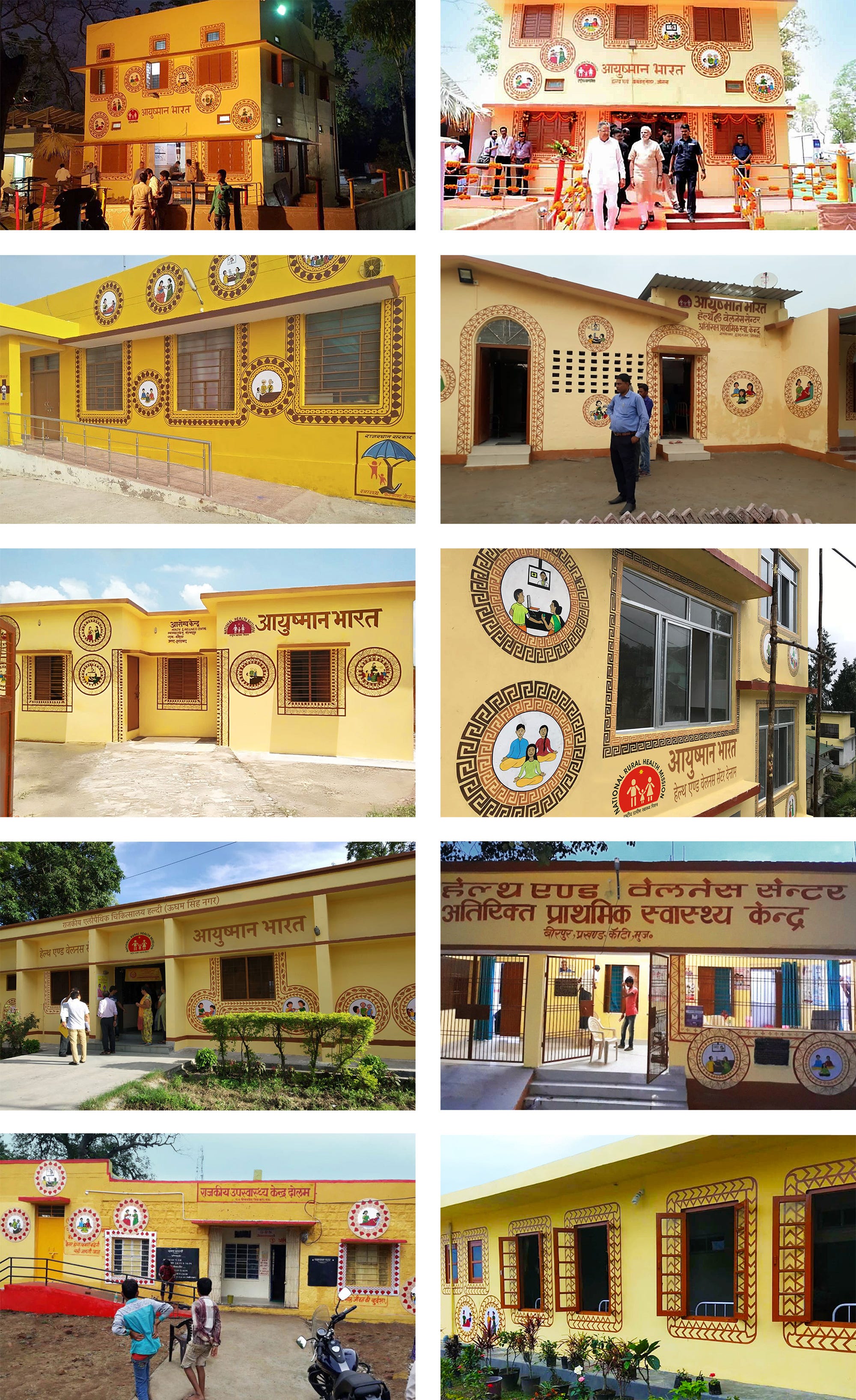
The government wanted to brand HWCs (Health and Wellness Centres) that are spread across India. The biggest problem is, how do you tackle branding a government agency, and how do you make sure that the result is adaptable across hundreds of thousands of buildings? Add to that the cost of professional graphic designers and contractors to implement thousands of final artworks. How can we achieve this feat in a cost-effective manner?
The visual branding for Government of India’s Ayushman Bharat program embraces India’s diversity, responding to its vision for ‘a people-centric and humanistic branding at the grassroots level.’ The visual identity is a result of the application system which is dynamic and adaptive using a basic template consisting of a square and circle which can be easily adapted to regional decorative art.
The design company, Lopez Design, wanted to solve this problem by making a dynamic system and adaptable graphics that can be executed by anyone.
Gina Krishnan writes for Business Standard about how Lopez Design, the firm behind the branding exercise for Ayushman Bharat HWCs, created a common foundation across centres with a dynamic visual system and adaptable graphics to respond to every community's comfort zone.
There was just a simple guideline like colors and placements, but the illustration and the exact execution can vary by miles. How wonderful is that, to not be bound by exact color, measurement and type of illustration, but still achieve consistency?
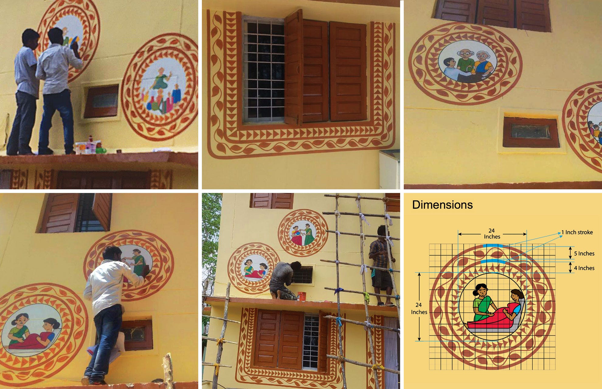
The designs didn’t require professional designers or contractors, just skilled artists.
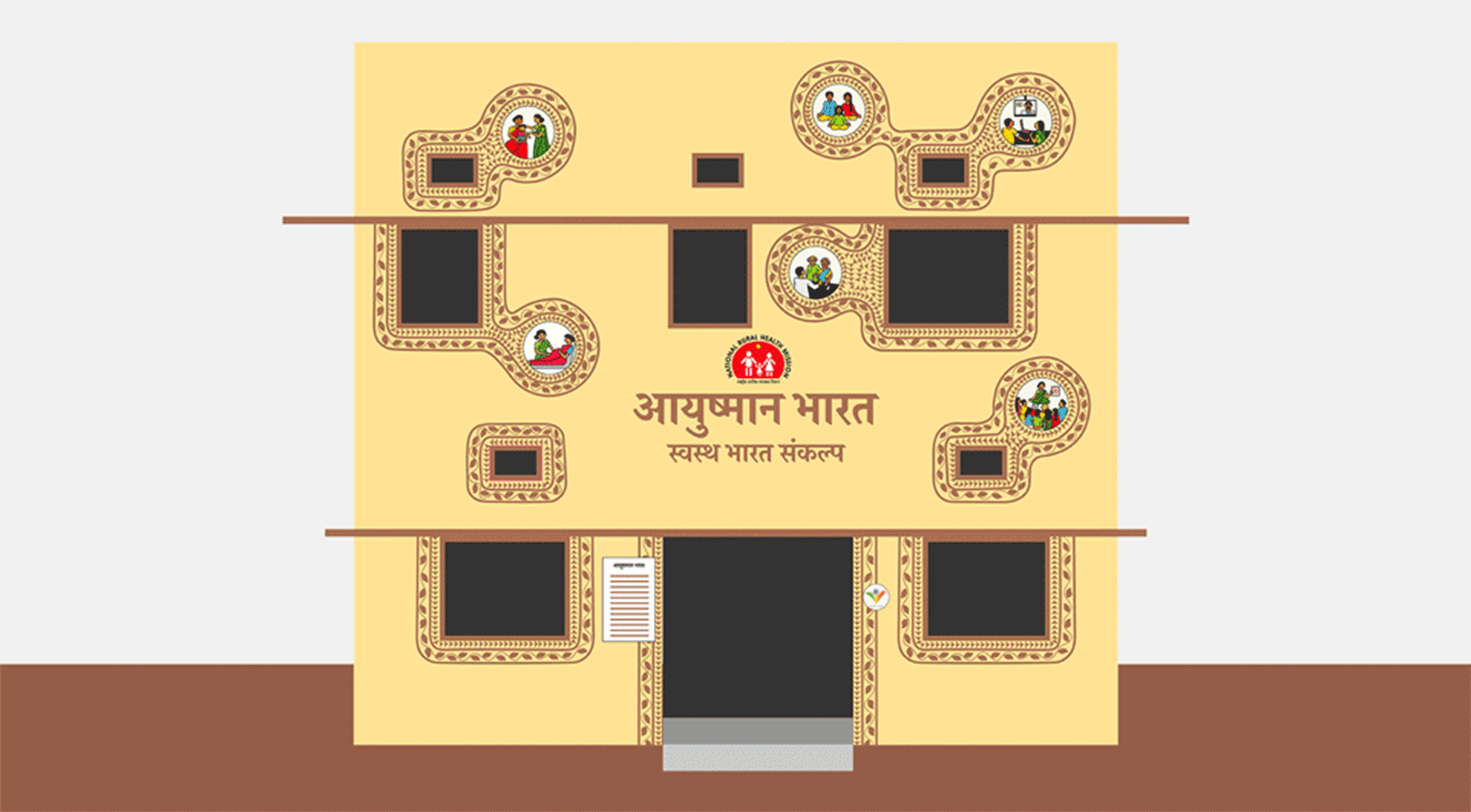
The placements can vary according to building layout and type, as there is no unified building.

Imagine having one simple guideline that says: “Illustrations can be put around a window. Just add two lines—no exact measure—with this color, and place it however you want.”
This design “system” not only defies all that we know about design systems: organized, meticulous, restrictive, gatekeeping and up on a pedestal. It sounds and seems like the design systems team is unreachable.
This design “system” is democratic, liberating, humanizing and at the same time, it achieves its goal to make the experience no less consistent, just in a different way.
As a UX team, do we want our product to sit in a pedestal, or be democratic, liberating and humanizing? You have the answer.
All pictures from:
“New Identity for Ayushman Bharat Wellness Centers by Lopez Design”, an article over at UnderConsideration: Brand New